| Topic | Actions Required |
| What can be posted? |
|
| When post? |
|
| When remove? |
|
| DOs and DONT's |
|
| Where are elevator sleeves located? | North Pointe - 2 elevators
Manor - 4 elevators
Court - 2 elevators
Plaza - 3 elevators
Terrace - 2 elevators
Health Center - 2 elevators
Main Garage There are a total of 16 elevators |
as of January 6, 2023
Tips for Effective Elevator Sleeves
- Know your audience! Residents are from 60 to 100 years old with eyesight from good to poor.
- Do not use Red text as it is hard for those with low vision to read.
- Use maximum contrast between the background and the words. Black on white is best. If using a background color, make it a lighter color.
- Use plain lettering such as Sans serif font Calibri and simple high-quality images.
- Do not put lettering over images, they are hard to read.
- Use 18 point font, when possible, with a larger font size for the title.
- Only use centered lines for the title and subtitle.
- Tell the reader what to do. Examples include mark the calendar or attend the event. Give the day of the week, the date and name and phone number of the event's contact person.
- Edit! Make fewer words count - like poetry. Readers are less likely to get bored and start scanning. Keep the message short and focused.
View or print the PDF version of Tips for Effective Elevator Sleeves.
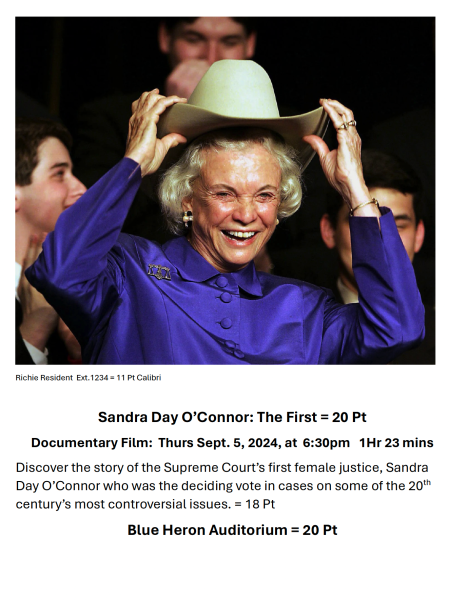
Example of elevator sleeve flyer

View or print a black and white sample of an elevator sleeve flyer.
Contact
For questions about elevator sleeves contact the Services Councilor.
